Some of the title sequences that we watched were; In the Cut, Se7en, and Panic room.
When watching the opening credits of 'In the Cut' they had a particular order in which they placed the titles.
Which was;
Production company - Pathe
Main actors
Less important actors
Different people that delt with music
Producer
Director
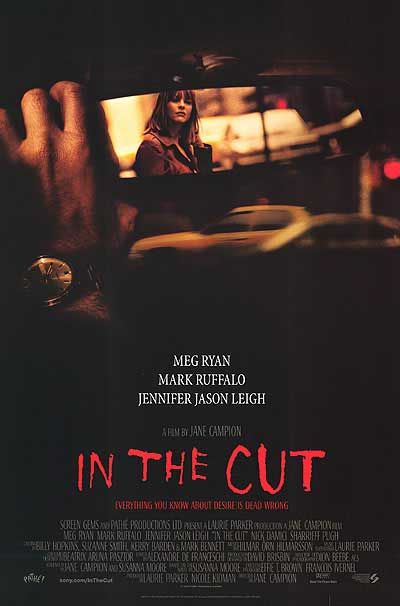
Main TitleI feel that the font for the main title is effective as it appears as if it has been cut into it and it is red like blood giving a bigger effect.
No comments:
Post a Comment